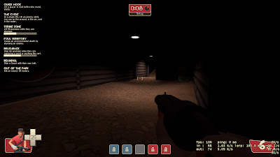
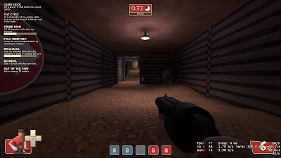
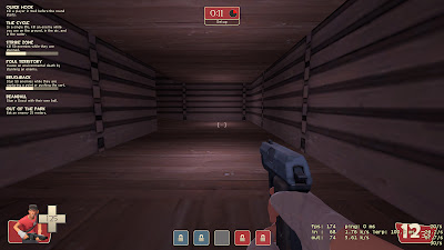
 In this one the area is just too dark and only has a directional light. I put in an area light to make it better.
A Light without a prop just looks weird.

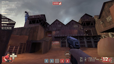
For this I think I got just the right purple with yellow to give it that afternoon look, and the outdoor spotlights actually point players where they should go.

No comments:
Post a Comment