Well, Studio 1 is over and I am satisfied with what i was able to pull off. It isn't entirely complete, it still needs tweaking, but I kind of realize now that my scope was a bit big. This was the first time i ever had made a map, and completely making, balancing, optimizing, and doing the art pass for a 5 point capture map just can't be done realistically in 7 weeks. Almost everyone is done, I just need to finish the 3-d skybox, some of the art, and set dressing, and finish area portals and hinting. Then, de-bugging and texture fixes, and minor tweaks.
I have the next two weeks as break and I'm not putting this project down. It will be ready for the world at the end of these next two weeks.
After that I will move right into my next one. I can't just do one map and say I've mastered Hammer, I really got to get back in there and practice. My first map is not going to be my best, and I can't wait to try to face the hard design decisions required to make another fully fledged map.
Thursday, August 26, 2010
Tuesday, August 24, 2010
Second Play Test
Well, the second playtest went really well. I got more good feedback, but less of the same types of feedback. The map is almost fully arted and it is fully lit. I also shrunk the map a lot, but it is still big, although it still isn't as big as say, Badlands, or Badwater Basin.
Some issues people had:
Some people wanted more ins and outs of the long paths, as they felt sometimes the paths were just too long from start to finish and there had to another way to join the fray. This should be easy enough to implement, just need to put in some more doors and stuff.
There were some slight coding issues. There was a spawnroom that was opening when it shouldn't have on the second point so the defending team could run in and out of spawn gathering health to fight off the enemy team. This lead to the 4th point being hard to capture and the negative feedback made the game last a bit longer.
I need to code in a Stalemate.
And everything else was minor, like a texture glitch, a leak in the map, or a badly clipped wall, all easily fixed.
All in all it was fun match and I will be uploading again when it is more complete. It is almost ready for TF2maps.net
Monday, August 23, 2010
I'm just tightening up those graphics
So I'm just tightening up the graphics , getting it ready to be playtested tomorrow. I finally got everything lit, even the outdoor environments, and every light has a corresponding model. I need to figure out some spawnroom code, I wish there was some kind of node editor I could use in order to have the logic relay, instead of just linking names with actions of objects and such.
Little Tweaks here and there, making sure all the health packs are where htey are supposed to be, and putting in doorways to all of my doors. I haven't started to clutter up the maps yet, It would be nice to have just random boxes and other stuff lying around, so i should get to that soon, but right now I'm more worried about the bigger picture stuff.
Little Tweaks here and there, making sure all the health packs are where htey are supposed to be, and putting in doorways to all of my doors. I haven't started to clutter up the maps yet, It would be nice to have just random boxes and other stuff lying around, so i should get to that soon, but right now I'm more worried about the bigger picture stuff.
Tuesday, August 17, 2010
Finally, a Playtest!
Well it is the 8th week in and finally, after 3 weeks of struggle, a version of the map was posted and played. I got a lot of good feedback. I made a list of things people said while we were playing it, it seemed balanced to everyone, and most people liked it and wanted to see it with more art.
Things to fix:
-Change the scale of some areas.
The map was too big. There was too much unnecessary travel time. The main paths were long and the long paths were longer. Also, it made it hard for engies to cover large areas. I am going to have to fix this one and it will probably take a long time since I am already so far into production: I wish i had known this sooner.
- you couldn't get out of Red spawn 2 due to a glitch. I found the problem and it has been fixed, it was a naming error.
- Lighting: certain areas were too dark and needed some more lighting.
- Too much/little visual interest in uninteresting/interesting places.
Many were saying that the sidepaths should be narrow, so we know they are side paths and not main paths. Also, no arrows should point to a long path: let us find those, but let the arrows lead us through the space in the fastest way possible.
Also, people wanted landmarks and props to clearly know what room they were in. They wanted each room to feel distinct so that anyone could pick it up and start playing and know their way around. I couldn't agree more, and I do need to implement more props that make each area unique.
Things people liked:
-Plenty of "long" or "secret" paths.
My snipers, engies, spies, and scouts all liked the alternate routes, and thout there were enough to use to tackle a situation from any angle. There wasn't a perfect engy build spot, there wasn't a fortress a sniper could hide in inevitably.
-Well balanced:
Even if it was big it had a good balance against each side, each point felt unique and needed to be approached differently, and each class could have fun and be effective in each area. There are some nice chokepoints for pyros engineers and demos and enough vertical action for scouts and soldiers. They liked the multitude of sniper holes and hidey holes for spys and some nice open areas for everyone else.
- The art and outdoor lighting
People really liked the first red point and the dramatic evening lighting. They said it felt like a western area and that was really what I was going for. It is named cp_Buzzard after all.
Sunday, August 15, 2010
Minute Errors and Wasted Time
So I just spent the last 2 hours fixing a problem that happened 4 hours of work ago.
While I was editing my map 4 hours ago, Hammer crashed and then a large portion of my map, 6 buildings and 2 walkways and the surroundings, got turned by 1 degree. I didn't realize this happened until 4 hours later, when I saw that one of my larger walls was slightly skewed. I could have gone to a previously saved version, but I would have lost 4 hours of work. I could have copied good stuff from an older version, but I was manipulating too much for these changes to be corrected. So I did the fastest thing and manually rotated each item that was improperly aligned.
It took 2 hours.
It was hard to tell what was wrong because such a large portion of the map was manipulated this way. I went through and had to manually change each item -1 degree, finding all the items was tough, what was even tougher was accidentally turning objects that didn't need to be turned making me have to find those items again and turn them back 1 degree.
Is it really that big of a deal? What is 1 degree? It means my maps would have leaks and would render vis leaves oddly. If an architect had half of the walls in his drawing skewed by 1 degree, the whole thing would be a nightmare and probably couldn't or shouldn't be built. Same thing here, it would just really mess everything up.
It is fixed, but the work was grueling.
Thursday, August 12, 2010
Lighting
I tested out some lighting. I used the Kelvin scale and I'm glad I did, it helped to pick the right purples, yellows, and reds for my shadows and light. Here are some good and bad screen caps.
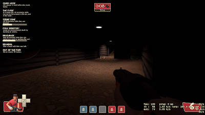 In this one the area is just too dark and only has a directional light. I put in an area light to make it better.
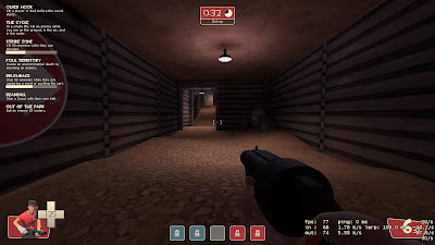
A Light without a prop just looks weird.
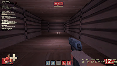
For this I think I got just the right purple with yellow to give it that afternoon look, and the outdoor spotlights actually point players where they should go.
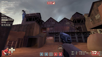
 In this one the area is just too dark and only has a directional light. I put in an area light to make it better.
A Light without a prop just looks weird.

For this I think I got just the right purple with yellow to give it that afternoon look, and the outdoor spotlights actually point players where they should go.

Tuesday, August 10, 2010
Technical/Social issues and Playtesting
It is hard to get all of the cogs and gears in place for a 12+ man playtest. I have to find a place to host my map file, a server to play it on, someone that owns the server to get my map files and upload them to the server. Then we need to find a time that not only fits into both of our schedule to put the map up for playtesting, but also need to find a time that won't interupt the normal playtime of the people that come to the server. So far the time hasn't really presented itself, tuesday is custom map night, but there are so many little erros that can get in the way and unfortanetly my map isn't going to be playtested.
I won't let this get in the way though, and I will move right into doing more modular art. As long as I don't do little details I should be fine if i have to manipulate the spaces of the map.
I won't let this get in the way though, and I will move right into doing more modular art. As long as I don't do little details I should be fine if i have to manipulate the spaces of the map.
Wednesday, August 4, 2010
Started Some Art
Been working on the art for the Red first point. I have been looking at old westerns and ghost town imagery while creating this. I'm trying to get a feeling for the way the buildings are created and put together, looking at different door structures, roof systems and other architectural systems. I like the feel of it and now it is time to go work on the blue side. I think I will do the typical red versus blue barn/industrial. Blue is going to be like a shipping yard or something.

Subscribe to:
Comments (Atom)